
Journaling For Creativity
Fifteen prompts inspired by the elements of visual art to define the ineffable, encourage creativity, and define our personal visual language

Foreword
The place journaling has in my life is not only introspection and meditation; within the pages of my journal I have sought and challenged my creative self.
These journaling prompts continue to stretch my repertoire because I take them very seriously. All prompts originate from an essay, a strain of thought, a curiosity to follow. These prompts are not simply “Journal prompts for X,” they interrogate what living a journaling life actually means.
Which means I wrack my brain to find the connection, the inspiration, and the language to connect opposing ideas and generate discussion. That is what journaling is: communication, connection, discussion, translation— all these yummy buzz words!
I would love to know what prompts resonate with you.
Happy journaling,
Jada
More writing about journaling:
How To Start Journaling

Advice that you haven't heard before, and a list of 13 prompts for your very first entry, whether you're a newcomer, or a tenured writer that wants to get back into journaling
For more journaling prompts:
Whimsical Journaling Rituals

Five energetic anchors to turn your journaling routines into rituals and thirteen prompts for a more whimsical practice to reinvigorate your writing
Discovering Our Personal Visual Language & The Search for the Ineffable
Visual language is a mode of communication: the elements of art convey ideas, invite creative interpretation, and serve as a foundation for how visual art is received. Alternatively, it is a mode of translation for the ineffable, as the visual communicate the farthest recesses of the imagination.
If we are to traverse the ineffable, undefinable spaces that visual art offers us, the elements of art not only serve as a brilliant starting point, but in their simplicity, transform visual language into language that we can use and a renewed way to travel through life.
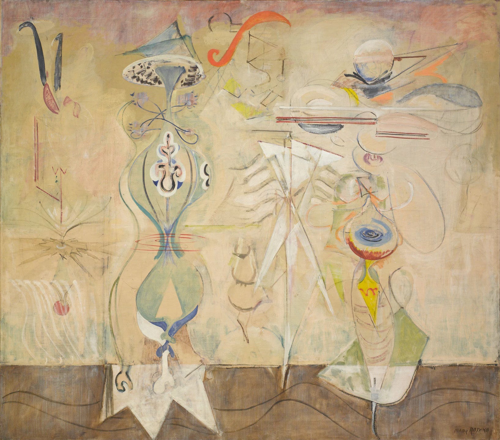
A Preamble About Rothko
For I can say that “I resonate with what I’m looking at” or that “this combination of colour, composition (or any visual component at that) agrees with me,” or “even I could do that” (as some may say) when viewing Rothko’s infamous colour paintings, but all of these statements waste breath when only considered at face value. Instead, using resonance, interest, and even dislike in conjunction with the correct language— even if it is the criticism behind Rothko’s ‘simple’ glowing, colourful rectangles— creates a filter through which to define the ineffable; to define what it means to us personally. That is what a personal visual language is: noticing visual components, but then also interrogating them; perhaps realising that we actually couldn’t do that. In the example of Rothko, perhaps our creative compass then begins to point us in the directions of meditation, contemplation and curiosity as we realise that these deceptively straightforward paintings are an attempt to convey fundamental human truths. Universal as they are, definable they are not. Compelled by our understanding of visual language, we can be lead to new creative dimensions.
Irony and Ineffability
Your compass may still point in the direction of being a Rothko naysayer. It may not. Or, you’re probably a journaler that is looking for new prompts. Preamble about art discourse aside, how does all of this relate to journaling? Stick with me here.
The irony of describing the unparalleled ineffability of visual art whilst attempting to assert journaling– a writing practice– is not lost on me. Journaling is also a powerful mode of communication and the translation of the introspective. Irony and ineffability are landscapes that creative thought thrives in when it is questioned and challenged. The first rule of any mode of creative translation is that there isn’t one; technique and structure has its merits as an important aspect of how art speaks to us, but how can I claim something is indescribable, and yet also suggest you attempt to define such things by learning about the elements of art? What use is knowing the fundamentals? To using words to write in our journals about what has been deemed “indescribable”?
I will tell you: there is a great use. We must learn the pillars and foundations of any medium, whether visual or written in order to sequentially disobey them. We must know them, interrogate them, learn them, so that we may in turn deconstruct them. I believe the ineffable happens within the transformation of new, unbelievable things that we did not previously consider. That’s what the compass is truly pointing towards.
ineffable | ɪnˈɛfəbl |
adjective
too great or extreme to be expressed or described in words: the ineffable mysteries of the soul.
“There is probably no conviction more deeply rooted in modern aesthetics than this, that works of art express what cannot be expressed in ordinary discourse,” writes W.E Kennick in Art and the Ineffable1. The writer cites others to support this argument:
“D.W Prall puts it this way: Cézanne was not just painting trees. He was giving us the feeling of them with the spaces and lights among them, their fine delicacy in solid volume and relations.... Language cannot name the feeling here given; for language cannot reach, in these regions of light and color and volume, the specification that constitutes the quality of an actual, determinate, individual picture.2
John Dewey puts it this way: If all meanings could be adequately expressed by words, the arts of painting and music would not exist. There are values and meanings that can be expressed only by immediately visible and audible qualities, and to ask what they mean in the sense of something that can be put into words is to deny their distinctive existence.3
Mrs. Langer, to whom the conviction is dear, has most recently put it this way: What does art seek to express?... I think every work of art expresses, more or less purely, more or less subtly, not feelings and emotions which the artist has, but feelings and emotions which the artist knows; his insight into the nature of sentience, his picture of vital experience, physical and emotive and fantastic.”
How Does All This Relate To Journaling?
These philosophers and art academics clearly segregate the visual and written from each other based on what is achievable and accessible beyond words. I don’t disagree, but branch off slightly in thinking about how the “realms of the ineffable” and pursuit of creativity, in practice, don’t exclusively cancel one another out. I’m not a philosopher but I am a visual artist and writer that prioritises the intersection of mediums, and so even though this essay is an attempt to go beyond the normal understanding of where visual and written journaling converge, it is really my hope to stretch it as a medium. Creativity thrives in paradox, irony and I believe that is how the ineffable is accessed.
Our creative interests and tendencies aren’t really meant to be explained, simply accepted as what we enjoy simply because we do. The ineffable is so because it is the intrinsic, natural and unexplainable compulsion of combinations that tickle our brain and just make sense. But awareness and (an attempt at) contemplating what the ineffable means, and what our understanding of visual elements are, shouldn’t be sidelined. A lack of a calling towards visual mediums does not mean you do not have a visual language that is personal to you. The above arguments imply that, therefore, writers do not have access to the ineffable purely because of choice of medium. I beg to differ. Despite being a collage artist, and previously an oil painter, I cannot conceive of visual journaling (scrapbooking or creating artistic pieces based on prompts) being helpful to my creativity personally, but the way I combine mediums is by acknowledging that the analysis of and my education in visual art is infused heavily, and an integral part of, my writing. My writing simply would not exist without it.
This understanding motivated me to write the following prompts, using this article as a dual purpose: to educate others on the fundamentals of art (which was a question I received a lot after my analysis of Leonora Carrington and Remedios Varo’s works) and to allow journalers to access their own ineffability, when they may not be particularly drawn to creating visual art.
A Quick Picasso Case Study
Artists exhibit time and time again where “opposing” materials, topics or mediums intersect in unexpected ways, or are explored unexpectedly. I experienced this first hand in Hakone during my visit to the POLA Art Museum, in which a ceramic owl was staring beady eyed at me, a presence in the exhibit that I couldn’t pinpoint, until I was surprised to discover that the artist that had created it was Picasso.
In 1946, Picasso rescued an injured owl in Antibes, which he kept as a pet in his studio for several years. The bird became a symbol of watchfulness, but also provided Picasso with a versatile and sculptural form that could be conveyed across mediums. Picasso even went as far to collage a self portrait of himself as an owl:
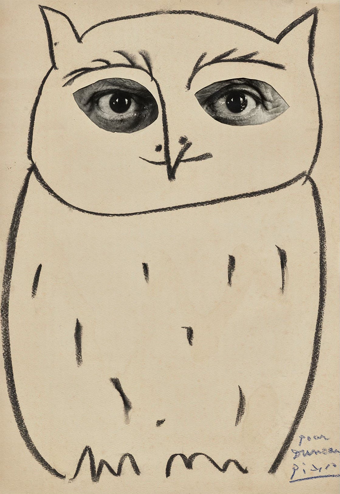
It is a subversive and vital act to remain curious and attentive to alternative mediums in order strengthen our creative capacities, diversify our inspirations, and access realms previously unattainable. It is important to be curious and multidisciplinary in our approach to creativity, which is why an understanding of visual elements— especially when we journalers are not visual artists— can create expansive writing practices. Applying them not only goes beyond our journaling practices, but if we learn to write about what we see, we challenge the very form and shape of journaling as a mode for communication and translation. The communion of pen to paper, when infused with an understanding of visual elements, allows us to join our creative selves at the seat of the ineffable.
“Art describes what words can’t.” Says who? Let’s give it a shot!
Prompts For Creativity Inspired By The 7 Elements of Art
Saying that “the elements of art are the fundamental building blocks” of visual art is the equivalent of saying “the mitochondria is the powerhouse of the cell”. The seven elements of art (line, shape, form, value, space, colour, texture) allow for the creation and interpretation of art. Each element has different categorizations, and are components that can be isolated and defined within a piece. In this journaling exercise, we will be going through each element, analysing some art, and then succeeding these with journaling prompts.
Happy journaling!
1. Line
Line is an element of art defined by a point moving in space. It may be descriptive, implied, or abstract, vary in width, direction, and length, and be horizontal, vertical, or diagonal, straight or curved, thick or thin. They lead your eye around the composition of an artwork, and communicate direction.
One of my favourite artists that utilise line in multidimensional and transcendental ways is Mikalojus Konstantinas Čiurlionis.
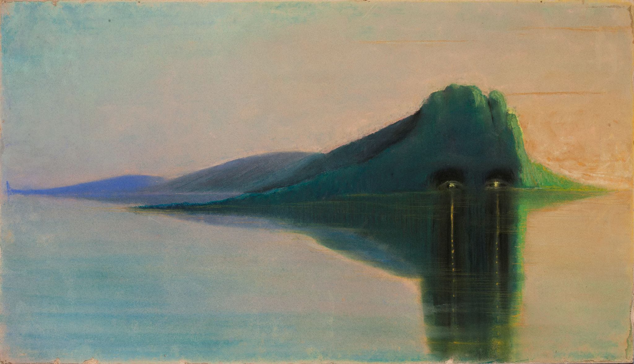
A horizontal line suggests rest or repose because of the universal understanding that objects parallel to the earth are at rest. The lines clarify and separate sections of a landscape, and can suggest continuation beyond the picture plane. Stability, expansion, calm and distance.
Whilst the title of the above piece, Serenity, supports this type of reading, Čiurlionis cuts the canvas in half through the horizon of the water, which looks calm. However, the reflection of the hill on the right side of the painting has two vertical lines which are painfully obvious against the gentleness of the rest of the painting; the fires on the beach resemble the eyes of a beast.
✷ Prompt: Define the aspects of your creative practice that you are comfortable with. On the flip side, are there parts you are scared of?
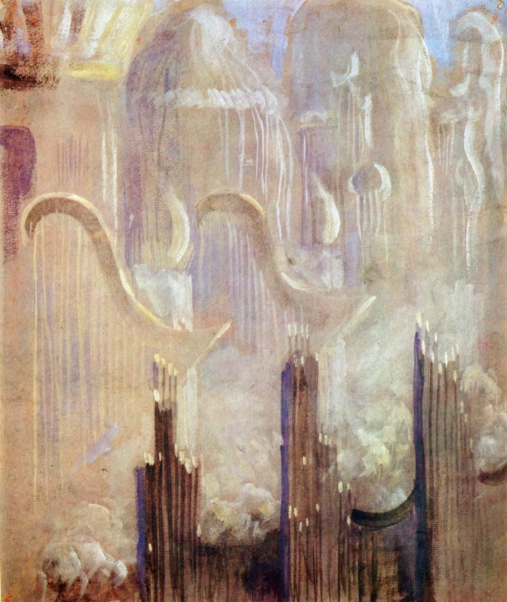
Vertical lines communicate height and expansion of a spiritual nature. These lines, that are perpendicular to the earth, suggest rising beyond human reach and towards the heavens. This expansion is not of distance, but a representation of contemplation.
Where Serenity is a simple use of line, Čiurlionis used vertical lines to create grandiose. Creation of the World is a series, or “cycle”, of thirteen paintings, many of which exhibit intense use of vertical lines. Creation of the World XI in particular has an ephemeral and grandiose quality about it, layering a black wall with three towers. Behind them are two giant harps, and in the background are three even larger towers. Here, vertical line is used to create forms like massive harps and looming towers, but also creates a sense of upwards meditation reminiscent of the title.
✷ Prompt: Think back to a recent piece of creative work that resonated with you: what wisdom can you discern from it from both a contextual and intrinsic standpoint?
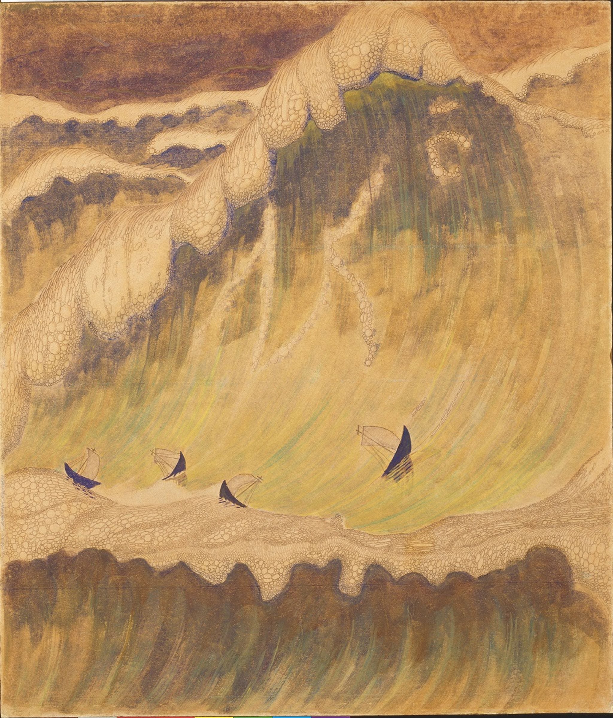
Diagonal lines create movement, of something already in motion. As these lines are neither horizontal or vertical, but are that ambiguous middle ground, we ask ourselves: are we falling, or rising?
Diagonal lines are oft used to paint natural forces such as waves, wind, and rain. In Sonata No. 5 (Sonata of the Sea) Final, the sheer size and force of the sea waves overwhelming the boats is achieved by diagonal lines.
✷ Prompt: Is there a creative project you have always dreamed of putting into motion? Describe in the present tense what the process of making and completing it feels like.
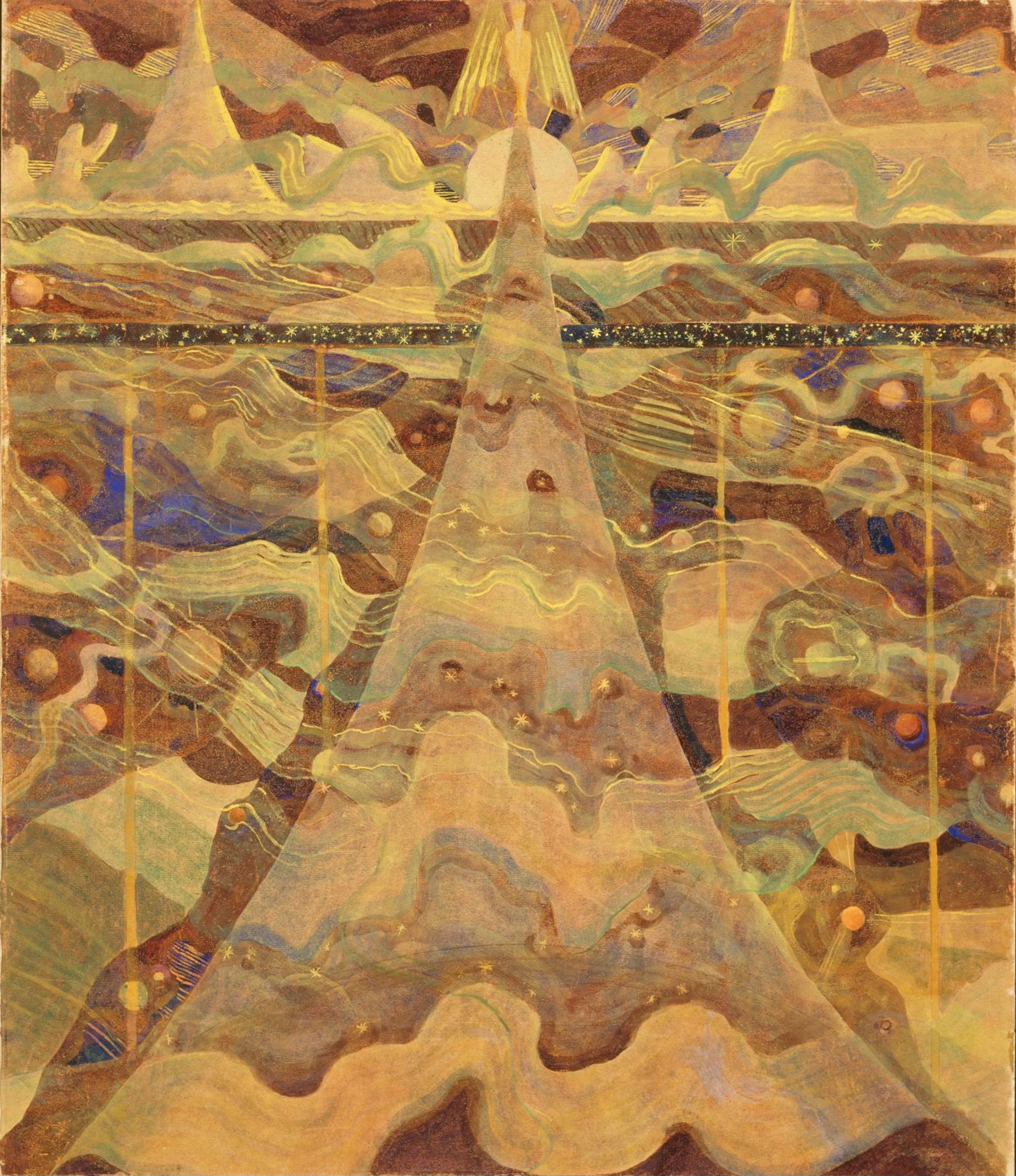
Curved lines are unpredictable and curious, and are slightly distant from diagonal lines because they can be in any direction and orientation, and instead of suggesting movement, they create energy.
Sonata No. 6 (Sonata of the Stars) Allegro feels like how my head feels when I use an electric toothbrush— energetic movement in all directions, a warbling vibration. Čiurlionis creates not only movement, but a cosmic landscape that is indefinable, dreamlike and playful!
✷ Prompt: In what ways do you invite playfulness and energy into your creative rituals and practices?
2 & 3. Shape and Form
I think it’s appropriate to combine shape and form together, as they share some components.
Shape possesses height and width, defined by a contour that can be created through line, colour, or value. Being limited to only height and width, it is two-dimensional and flat. They can be organic or geometric.
Organic shapes are irregular or asymmetrical, most often found in nature. Geometric shapes are mathematical such as rectangles, squares and circles. Both can be manmade.
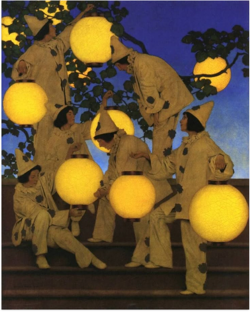
One of my favourite examples of shape is The Lantern Bearers by Maxfield Parish, simply for how satisfying and whimsical the circular lanterns that the pierrot are holding. The use of shape creates a buoyant, weightless quality to the piece that highlights the transformative power of light as a symbol of resilience, whilst still maintaining a unified, playful and enchanting scene. The figures in the painting are believed to be inspired by classical mythology, evoking the timeless themes of beauty, grace and transcendence that circles oft symbolise.
In its fullest sense, the circle is a universal symbol for wholeness, eternity, and the cyclical nature of the cosmos. In Classical and Christian myths, the circle also represents cosmic justice, destiny, and the inevitable turning of fortunes— all seemingly ineffable subjects. In The Lantern Bearers, circles are used as a nod to sacred geometry, in which circle halos, nimbuses or mandalas, signify the aura of the protective power of the divine. It is incredible how something so profound can be communicated through shape!
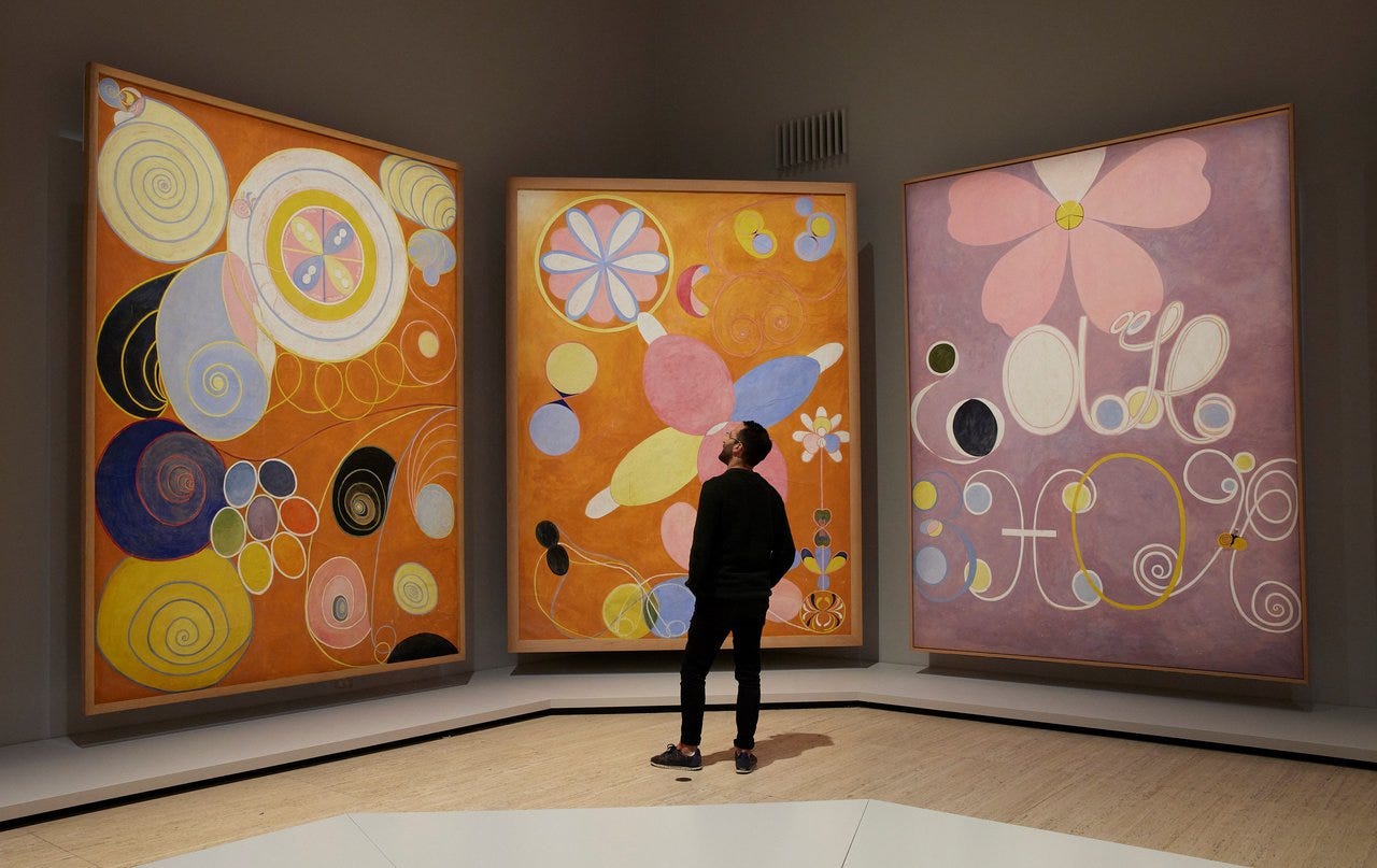
When I think of an artist that has mastered the use of organic shapes, I think of Hilma Af Klint’s The Ten Largest, which is a series of “ten paradisaically beautiful paintings” that would “give the world a glimpse” of the stages of human life. These paintings are botanical, natural, abstract, and are composed of a myriad of organic shapes that resemble shells, pebbles, eggs, flowers, insects; a plethora of natural ephemera saturated in vibrancy. Klint’s use of organic shapes suggests a connection to the natural and become representative of the transformative and unpredictable nature of human development from childhood, youth, adulthood and old age.
✷ Prompt: When you were a child, what was your favourite way to express yourself? Explain a core memory associated with it, and how that medium evolved over time.
These pieces, when observed together, remind me about the storytelling aspect of art. In this way, the “ineffable” human experience and ambivalence is communicated without a central subject matter, and instead with intentional organic symbolism that feels both child-like and deliberate. These pieces, whilst exuberant, should not be deceptively thought of as mere shapes— they represent something much more beautiful.
✷ Prompt: What organic shapes that exist in nature inspire you the most? What does their shape teach you?
If you haven’t guessed it already, form is three dimensional. Also known as volume, it represents architecture and sculpture, but also the aspect of two-dimensional art that would suggest the illusion of dimension. Like shape, form also includes geometry within the three dimensional: spheres, cubes, cones. These forms enclose volume, consisting of height, width AND depth.
Some famous statues include the Terracotta Army of X’ian, Michelangelo’s David that sits in Florence, or the looming Christ The Redeemer in Rio di Janeiro, and whilst each of these pieces have grandiosity, history and faith at their foundation, I do not wish to discuss any of them to show you form.
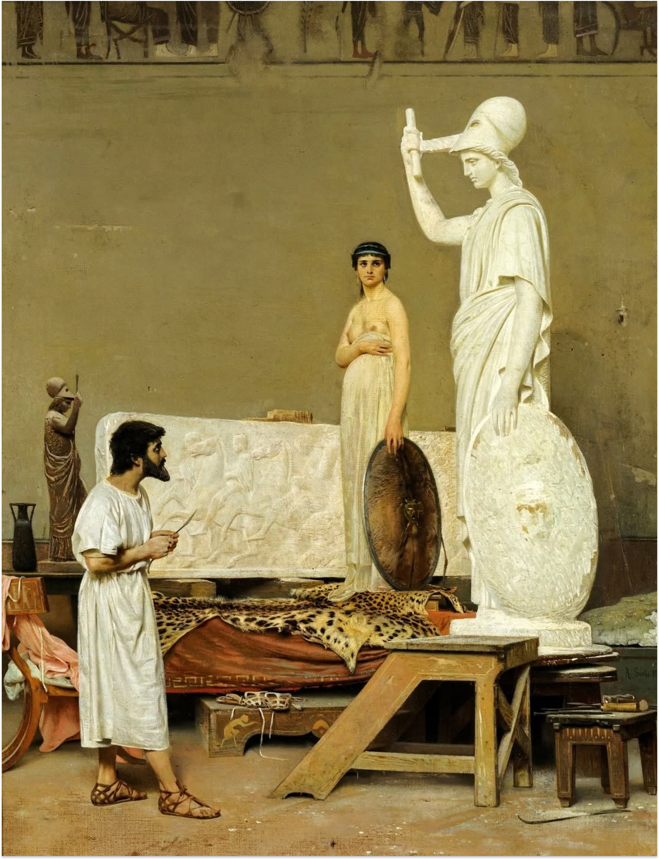
Sculpture is a medium with profound impact, and ironically, one of my favourite paintings that depict this uses form to create a tableau, a time capsule, an inner glimpse into a sculptor’s workshop. Phidias In His Workshop, Carving The Statue of Minerva, was commissioned from Rafaello Sorbi by sculptor Giovanni Duprè. Two conditions were to be met: that the painting portray Phidias mid-work, carving Minerva, and a part of the Parthenon frieze in the background. Both Minerva and the Parthenon frieze portray form and are vital to the theatrical and romantic nature of this painting— grand works such as these were “not carved in situ by in the workshop.” The painting feels like a symbiotic ode to sculpture, both in the importance of actual three dimensional works, and a sculptor’s workshop being a subject of fondness, as commissioner Duprè personally identified with the figure of Phidias. Phidias was the artistic director of the Parthenon, and one of the most significant figures in ancient Greek artistry. Truly, I can think of no better artwork to depict the impact form has across the ages.
✷ Prompt: Tap into a corner of your imagination that remains “uncharted”. Why have you not yet given it form? What do you need to do in order to give it shape?
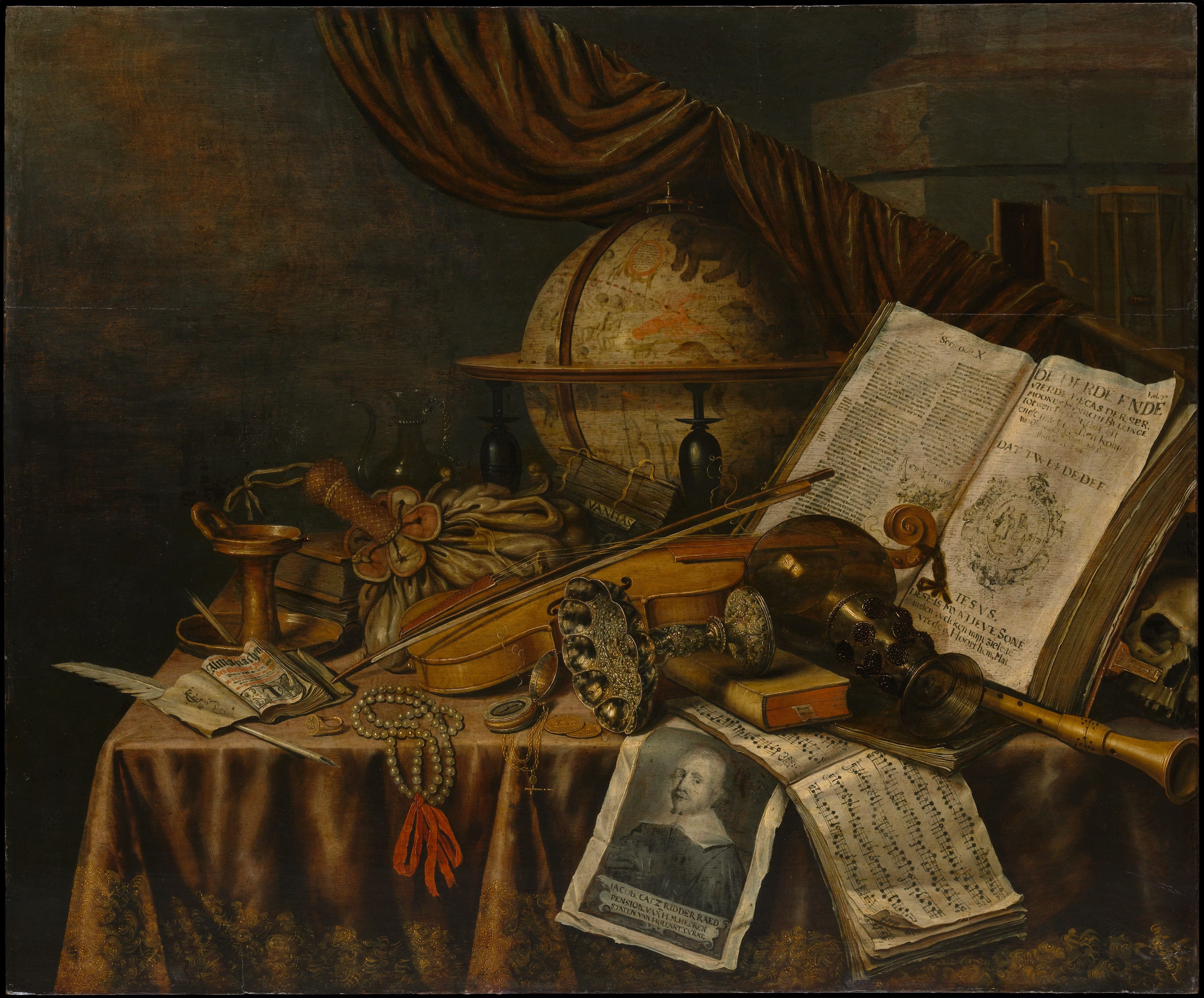
Still life is not just about fruit. There are actually multiple still life themes that portray the illusion of three dimension within the two dimensional, through the arrangement of inanimate objects. Vanitas or Memento Mori is a philosophical style responsible for those brooding symbols like skulls, hourglasses and candles, that represent the fragility of human mortality. Kitchenware and tableware create a unique blend of teacups, kettles, bottles, and other vessels, but my favourite motif in Vanitas are instruments, books, curtains, jewellery and globes. Form is created through how material such as silver and copper interact with light, which suggests three dimensions.
Vanitas Still Life by Edwaert Collier utilises form to create disarray; the objects in the painting are arranged in multiple X-patterns that attempt to create some cohesion, but the tipped over tazza and green-glass roemer are decorated elaborately. Collier focuses on the form of reflective surfaces, but there is also a sense of unity in this painting: “the pearls, the moneybag, the oil lamp, and the books look nearly as wooden as the violin and the shawn.”4
These objects portray wealth and individual intellectual accomplishment, with objects of learning being of particular emphasis to represent literature, music, and hobbies such as astronomy. Combined, these objects form an outlook that doesn’t need a skull, an hourglass or a candle a I previously mentioned. What makes this painting so interesting is that none of the usual Vanitas memorabilia are present, instead offering a monochromatic wash of items that will eventually be eroded like time, or whiffed away like smoke from a fizzled out flame; “like … days marked by an almanac, hours ticked off by a watch, a tune played on the shawn, and measures of music. A string on the violin has conspicuously snapped.”5
✷ Prompt: If there was a still life of your personal symbols, icons, or memorabilia, what would it look like? What message would it portray?
4. Space
Since we have touched on form being three-dimensional, it is sequential to continue with space. Whilst space in reality is three-dimensional, space in art refers to that feeling of depth, as well as an artist’s use of area. These areas are referred to as both positive and negative space.
How an artwork is received or interpreted can be greatly attributed to how an artist portrays the relationship of positive to negative space. The amount of negative space, if disproportionate to the subject, can suggest isolation, whilst a lack of negative space would infer chaos or busyness in a piece.
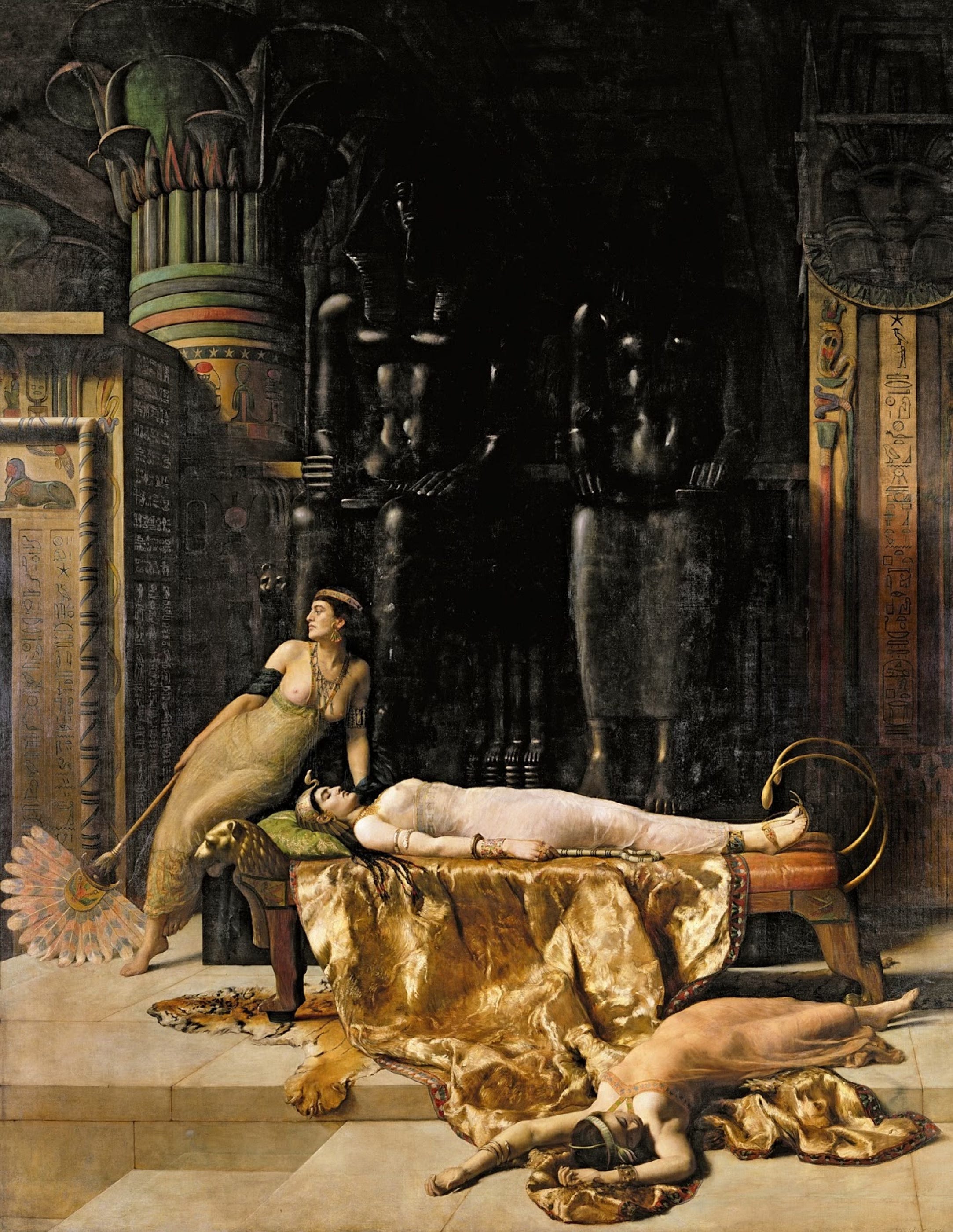
In The Death of Cleopatra by John Collier, positive space is granted to the three subjects in the foreground due to the lighter colours— we understand that these figures are the subject of the painting. Whilst the background has elements such as walls with hieroglyphs and looming statues in the receding darkness, this can still be regarded as negative space, as there is nothing that obstructs, or is equal to, the figure lying down in the lower half. Rather than isolation, negative space is used in this painting to a macabre nature. For the majority of the vertical length of the canvas, there is a stretch of darkness and lack of a focal point between the figure lying on the chaise, whom is presumably dead.
✷ Prompt: Write a creative ethos. What messages do you hope will survive you?
“Luxury and ruin meet face to face”6 where positive and negative space converge in the painting— which is notably incredible large at 3x4 metres! This creates a canvas that almost feels like theatre, a narrative painting that through its opulence, scale and dense shadows, portrays not only the dignity Cleopatra’s stillness in choosing death over humiliation, but also how her attendants remain “suspended between loyalty, grief, and ritual.”7 This suspension is inferred through the positive and negative space.
✷ Prompt: Do you view creative blocks as stillness or stagnation? In what ways can your creativity thrive when you take a break?
✷ Prompt: Choose one of your creative pieces and provide an alternate meaning to what you originally intended.
5. Value
Regardless of colour, value refers to lightness or darkness of a colour or tone, creating the illusion of form, depth, and most importantly, contrast. Strong differences between light and dark values stand out, whereas gradual changes make flat shapes appear three-dimensional. Value plays a role in unifying the piece (or the opposite!) and artworks that are high-value (lighter) have more positive associations than low-value (darker) pieces, which instead create drama and mystery.
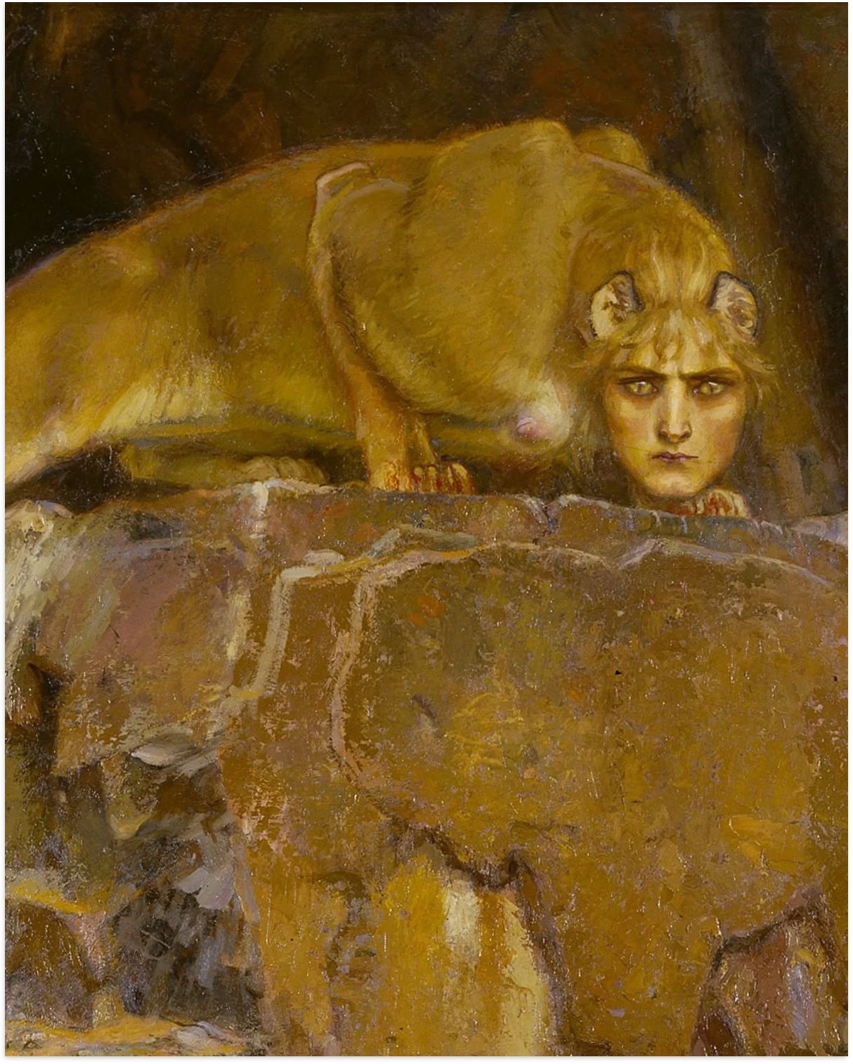
The Sphinx is an almost monochromatic piece that is an example of the middle ground between low and high values. The predominant ochre colour is included in all elements of the painting, from the sphinx, the rock she is perched on, and the cave in the background. The sphinx is a merciless being with the head of a woman and the haunches of a lion, whom according to Greek myth challengers those who encounter her to answer a riddle, ultimately eating them upon their failure. The lack of contrast between values in this piece still gives form to the rock and the sphinx, but barely. Von Rosen uses value to camouflage his subject, showing how her deception and malicious intent is hidden behind her riddle. Is she a lion, or a woman? Is that a rock, or a sphinx ready to pounce?
✷ Prompt: What internal feelings are hidden in your creativity? Are they positive, negative, or a bit more complicated?
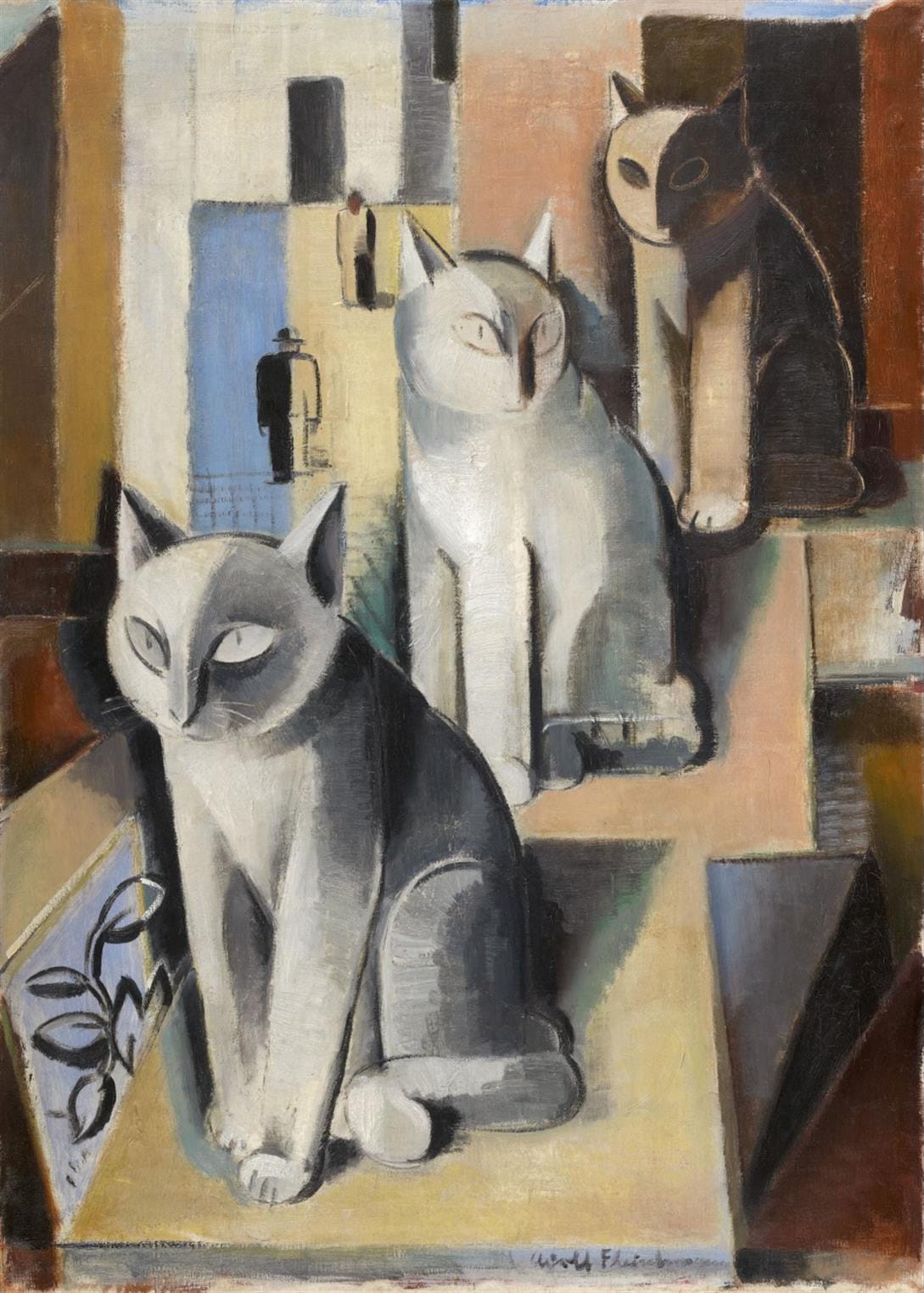
Another feline focused piece that shows value is Drei Katzen (The Three Cats) by Adolf Fleischmann. This piece shows a clear distinction between light and dark and the gradient of values creates three cats. The closer the degrees of value, the more realistic or defined the cats are, such as the one in the foreground, until you reach a silhouette where only the broader details of light and shadow can be distinguished in the last cat.
✷ Prompt: Write about two polarising or opposing aspects of your creativity. How can you combine them? Where do they actually share similarities?
6. Texture
Many of the pieces I’ve shared thus far have included texture: reflective surfaces, wood, stone, fur, paper. Smooth, rough, fuzzy, bumpy, furry, feathery, silky, buttery, glutinous, slick— these are all sensory adjectives that describe a tactile experience, because texture refers to the illusion of feeling.
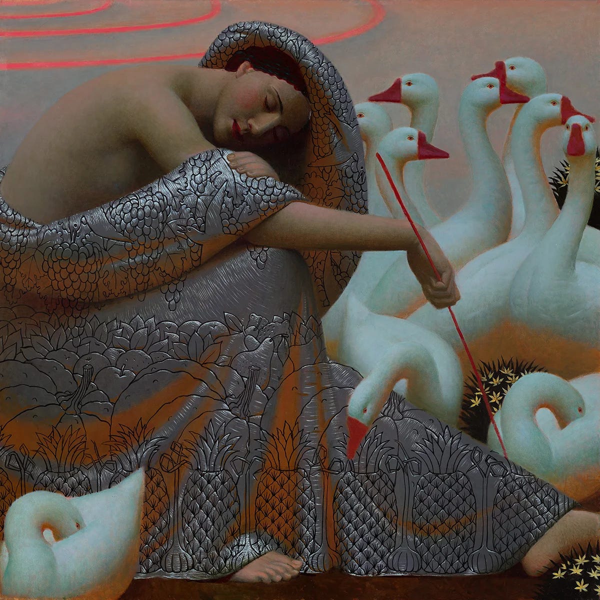
In Andrey Remenev’s Roman Holiday, the two major elements in the painting (the geese and the woman) portray texture: the geese are silky, the woman’s skin is smooth, but her robe has fruit and vegetables embroidered on a metallic material.
✷ Prompt: Make a list of tactile adjectives that you associate with your creativity, even if they aren’t related to art at all.
7. Colour
And finally, we circle back to Rothko, whose use of colour is undeniable. The visual element of colour need not be explained, only observed, in a realm of its own ineffability.
When I reference Untitled, I could be talking about any of roughly 600 pieces. His catalogue raisonné include 836 works on canvas, and over 2,600 works on paper. A significant majority are either unnamed, or feature descriptive colour pairings or numbers that were casually assigned later. During an address at the Pratt Institute in 1958, Rothko provided a “recipe of a work of art”, with 7 specific “ingredients” for a work of art: preoccupation with death, sensuality, tension, irony, wit, chance and hope.
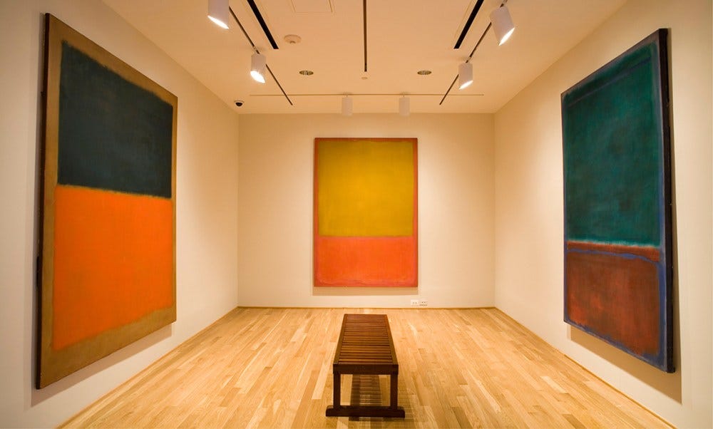
Out of all of the elements of art, colour is many things: the most universal, identifiable, obvious. All of the artworks I have shared thus far have colour, but Rothko’s colour fields are (almost) exclusively colour.
Rothko’s belief was that art should connect deeply with universal emotions.The key distinction to make is that Rothko painted to convey fundamental feelings, “basic human emotions”, rather than intellectual concepts. In this way, the ineffable is also the most simplistic. That is the power of understanding visual language— that it all, in some way, shape or form, eventually circles back to the human condition.
✷ Prompt: Write what the link between the ineffable and creativity means to you. Give it a colour. Describe that colour using only words.
Very rarely do the elements of art exist in isolation of each other. Our creativity has multiple languages. The elements of art are not a formula for making meaningful work, nor are they a checklist for interpreting it correctly. They are simply a vocabulary. Like any language, they become most interesting not when we recite them, but when we begin to speak with them in our own voice. We learn line, colour, shape, form, space, value, and texture not to imprison the imagination within definitions, but to begin listen to the intrinsic undercurrents that connect even visual and written mediums together.
We are all, in one way or another, collecting a private lexicon of images that point toward the same enduring questions. I hope that these prompts allow you to become more fluent in conversation with your creativity.
Happy journaling,
Jada
Journaling Prompts For Creativity
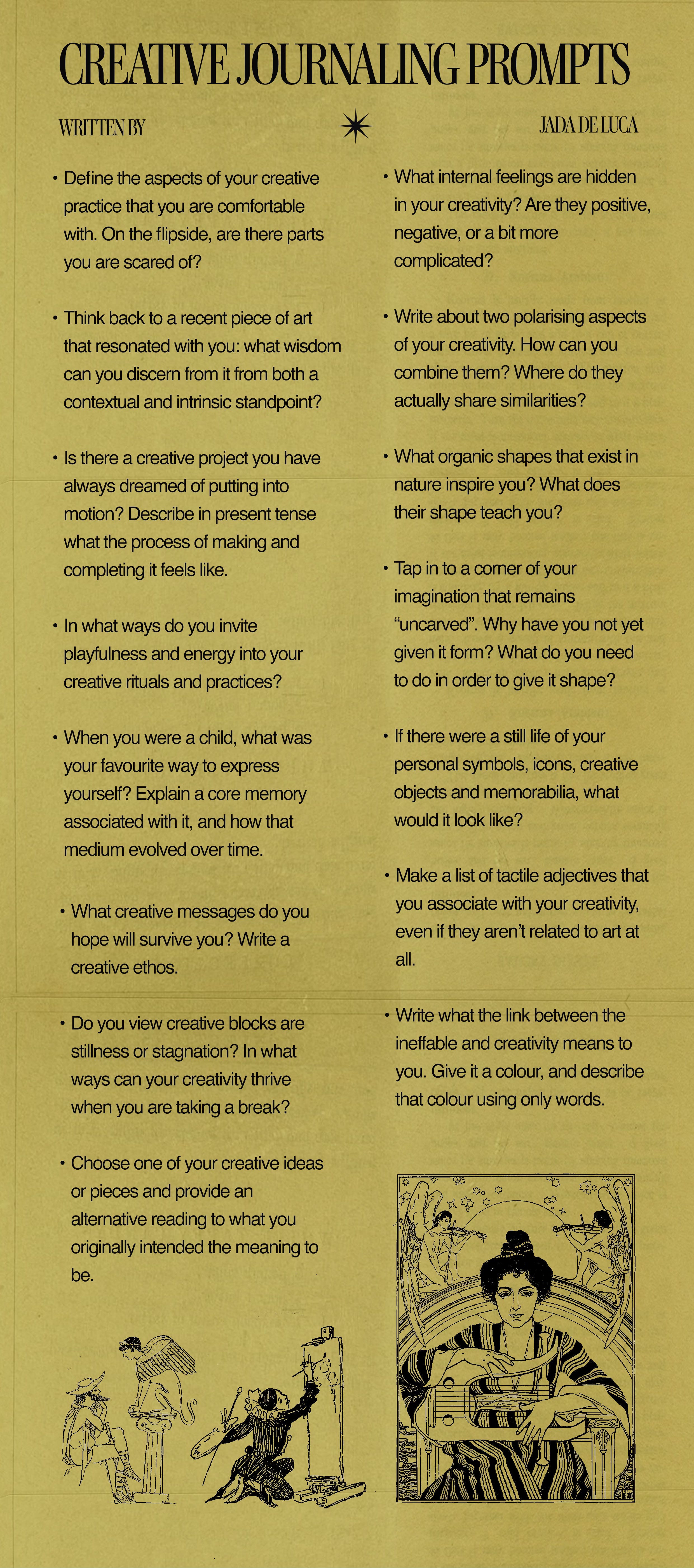
Define the aspects of your creative practice that you are comfortable with. On the flip side, are there parts you are scared of?
Think back to a recent piece of art that resonated with you: what wisdom can you discern from it from both a contextual and intrinsic standpoint?
Is there a creative project you have always dreamed of putting into motion? Describe in present tense what the process of making and completing it feels like.
In what ways do you invite playfulness and energy into your creative rituals and practices?
When you were a child, what was your favourite way to express yourself? Explain a core memory associated with it, and how that medium evolved over time.
What creative messages do you hope will survive you? Write a creative ethos.
Do you view creative blocks are stillness or stagnation? In what ways can your creativity thrive when you are taking a break?
Choose one of your creative ideas or pieces and provide an alternative reading to what you originally intended the meaning to be.
What internal feelings are hidden in your creativity? Are they positive, negative, or a bit more complicated?
Write about two polarising aspects of your creativity. How can you combine them? Where do they actually share similarities?
What organic shapes that exist in nature inspire you? What does their shape teach you?
Tap in to a corner of your imagination that remains “uncarved”. Why have you not yet given it form? What do you need to do in order to give it shape?
If there were a still life of your personal symbols, icons, creative objects and memorabilia, what would it look like?
Make a list of tactile adjectives that you associate with your creativity, even if they aren’t related to art at all.
Write what the link between the ineffable and creativity means to you. Give it a colour, and describe that colour using only words.
Afterword
What’s your favourite Rothko painting? Mine is Untitled. Which one? I think 1962.
I hope you enjoy these prompts, and thank you for 4000 subscribers! My Whimsical Journaling Rituals has recently seen a surge in new readers, so welcome to the newsletter!
Please note, I create these exercises free of charge, as accessibility to a reading, writing and journaling life is important to me. If you enjoy these monthly prompts, please consider becoming a paid subscriber to support my work.
Thank you for reading,
Jada
✷
@fujijada
jadadeluca.com
deluca.jada(at)gmail(dot)com
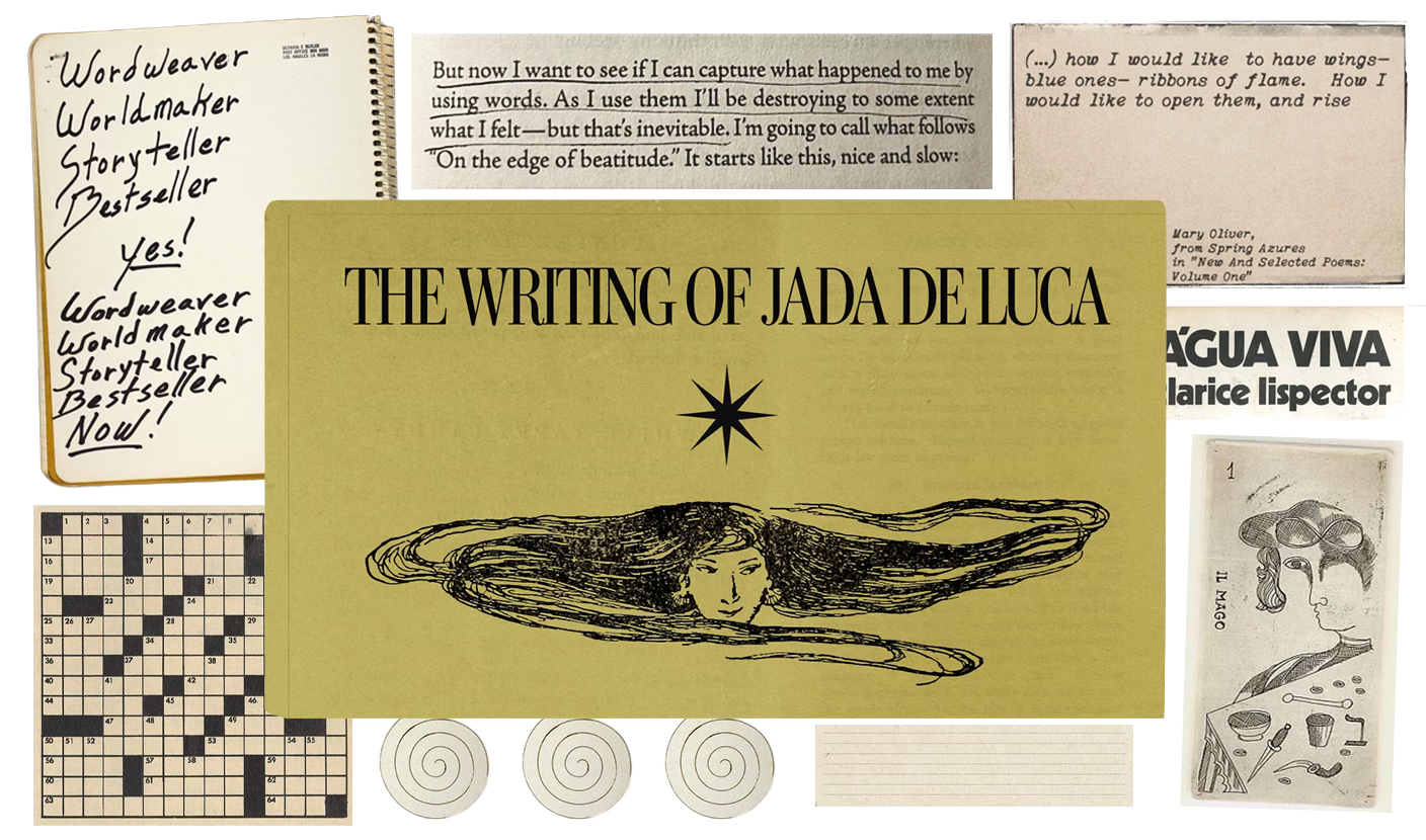
Italian-Samoan writer Jada De Luca is a visual narrator, storyteller and devout journaler. She writes about leading a reading and writing life, inspired by Mary Oliver’s poem Sometimes:
Instructions for living a life:
Pay attention.
Be astonished.
Tell about it.
Telling stories through both written and visual narration (she is also a collage artist) is her way of paying attention to the magical, surreal, and intensely personal landscapes that the arts offer. Her newsletter is a source of her entire writing career; her oeuvre; a commonplace journal of essays about literature, language, writing, travel and art.
Jada’s favourite novel is Água Viva by Clarice Lispector, her favourite tarot card is The Magician, and she likes her tea with an extra sugar.
The Journal of Philosophy, Volume LVIII, No. 12 (June 8, 1961)
Aesthetic Analysis (New York, 1936), pp. 162-163
Art as Experience (New York, 1934) p. 74
Catalogue from Met Museum (2016; adapted from Liedtke 2007)
Catalogue from Met Museum (2016; adapted from Liedtke 2007)
The Death of Cleopatra, The Virtual Museum
The Death of Cleopatra, The Virtual Museum
Saving all of these - I keep wanting to journal, I build a habit for about three weeks, then i fall off and don't touch it for months! But these seem like a great way to restart